IX Designer - HP Smart Privacy Redesign
Challenge
From past research we found that the privacy screens in the printer setup flow were copy heavy and therefore hard to read and time consuming. Users had a difficult time understanding what they were consenting and did not seem engaged in the privacy information. We needed to keep the current privacy language due to legal regulations, but thought about how we could present the consents in a way that were more clear and engaging to the user to build trust and confidence.
My role
I led the design effort as the interaction designer and collaborated with visual designers and copy writers to deliver the designs to development teams. I developed and conducted a user test and summarized the results for presentations to leadership.
In addition, I worked alongside product managers, developers, and legal representatives to ensure the project met business goals, understood legal limitations, and created an excellent user experience.
Early insights
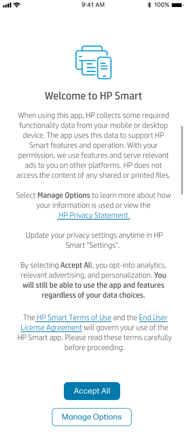
From customer service findings, we knew that users had a difficult time reading the current privacy screens. Users would either not read the lengthy text, and consent without reading fully, assume HP was hiding something and distrust the brand, or read the screen and get frustrated with how long it would take. Our initial assumptions were that grouping the copy would help readability and aid the user in understanding the consents at a quick glance. Pictured are the current HP Smart designs.
Discovery
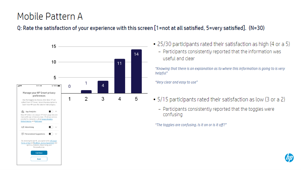
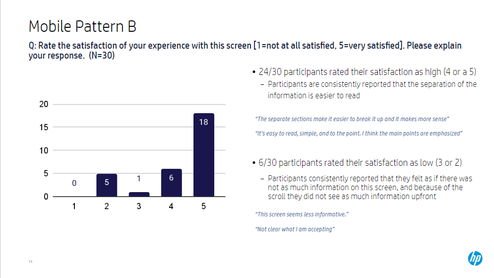
In these tests we found that users preferred more obvious groupings that explained the different options the user had to manage their privacy preferences. We found that users were more likely to read the more visually engaging screens and understood what they were consenting to at a higher rate.
“The cards really stand out and makes it easy to follow along. It is very easy for me to understand".”
“I wish that every app did this. I have a sense of confidence that HP respects my privacy.”
"This screen is so much easier on the eyes, and simplifies it in a much easier to read and organized way.”
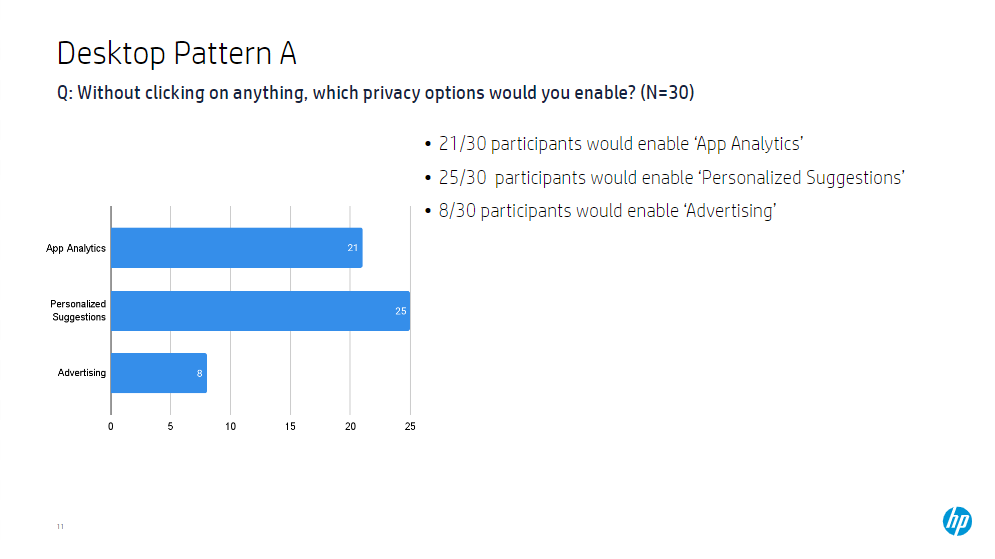
We launched a user test to explore new visuals and groupings to improve usability and tested them against the current experience.
Reframing the problem
How can we… present privacy notices in a more engaging and informative way while still maintaining legal and business expectations?
Redesign
After testing and reviews with legal and privacy team members, we opted for the card design. It proved to be the easiest for the users to read and gave users the trust in HP to have the confidence in the consent choices they make.


